Between Sun and Moon: the Highlight London brand system
How a beauty creative studio built an identity on two forces, intuition and precision.
June 2026 · 5 min read · For Founders, Creative Directors, Heads of Brand
Highlighting is an act of illumination. To highlight is to let something appear naturally through light, to reveal what already exists yet has not been seen. We treat light as a living substance that thinks, questions and uncovers. The brand system on this page exists to protect that idea.
Visual DNA, light as language
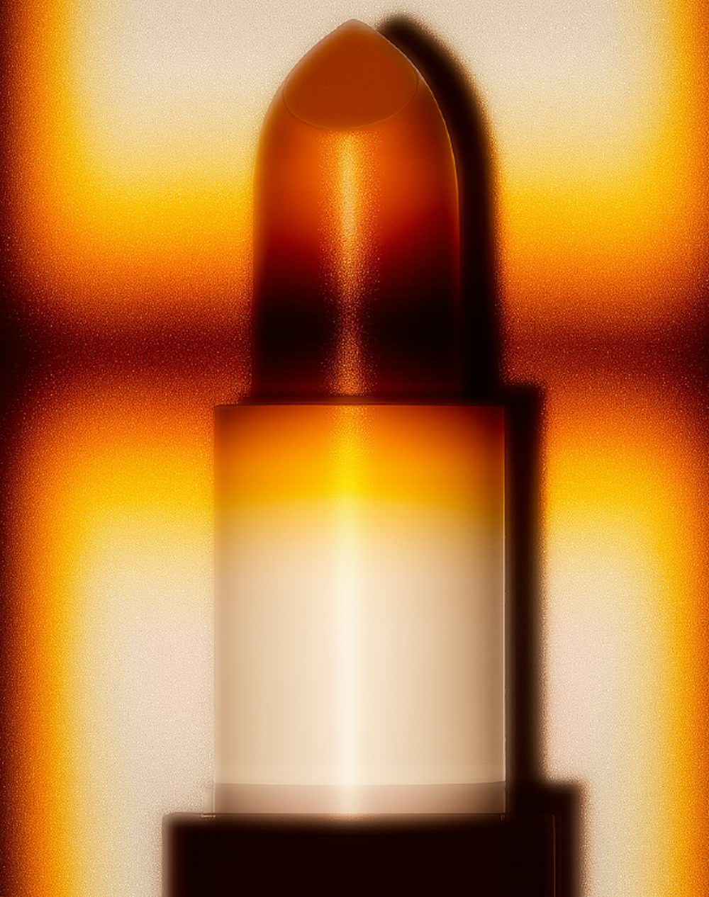
In our images, light functions as language. Specular reflections, macro details and iridescent surfaces give form to what is usually invisible. What appears on the surface is only part of a deeper conversation between matter and perception. Every reflection carries intention, and every highlight becomes a trace of awareness.
The palette stays neutral, with gentle golden warmth and clear whites calibrated around 6000K. It carries sensuality and clarity at once. The overall feeling is quiet, cinematic and slow. Highlight London invites a slower gaze, one that discovers rather than looks.
Visual DNA · light treated as a living substance
The mark, gesture meets structure
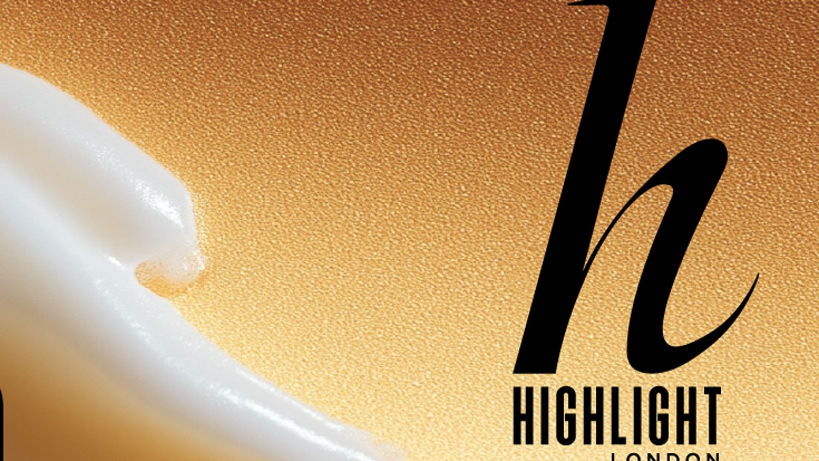
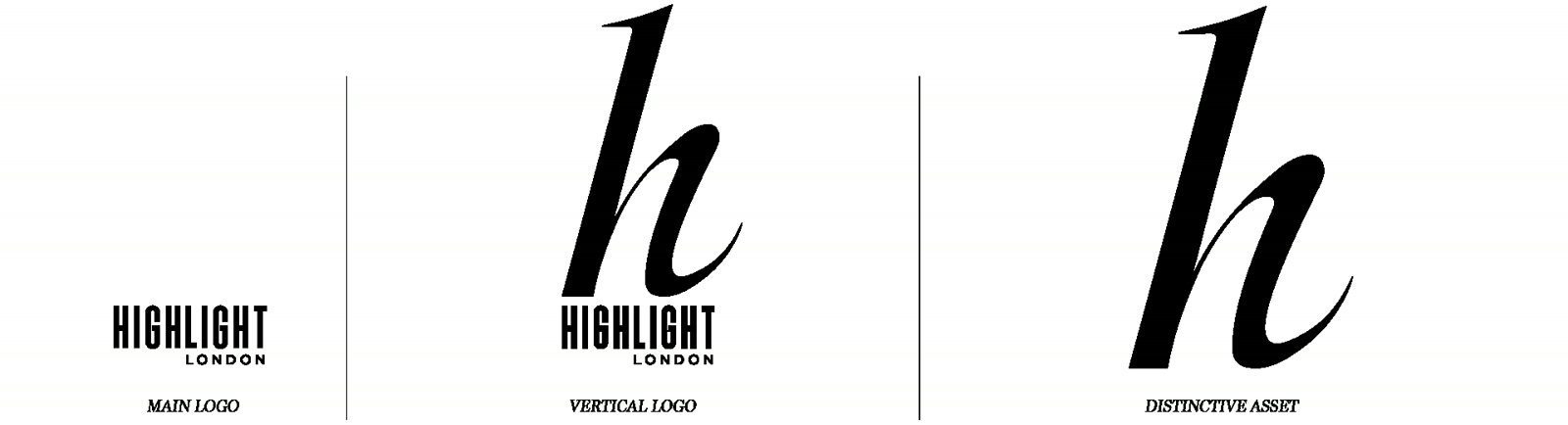
The mark holds two ideas in one. The large h is the gesture, the light, the creative intuition. Its calligraphic shape evokes the movement of a brush or a trace of light in the air. It carries the human, sensitive side, the one that perceives beauty before it is expressed.
The word HIGHLIGHT, set in tight upright capitals, carries rigor, strategy and structure. It stands for the rational dimension, the one that turns vision into a coherent visual system. The discreet LONDON beneath grounds the whole in place, precision and craft.
Main logo · vertical logo · distinctive asset
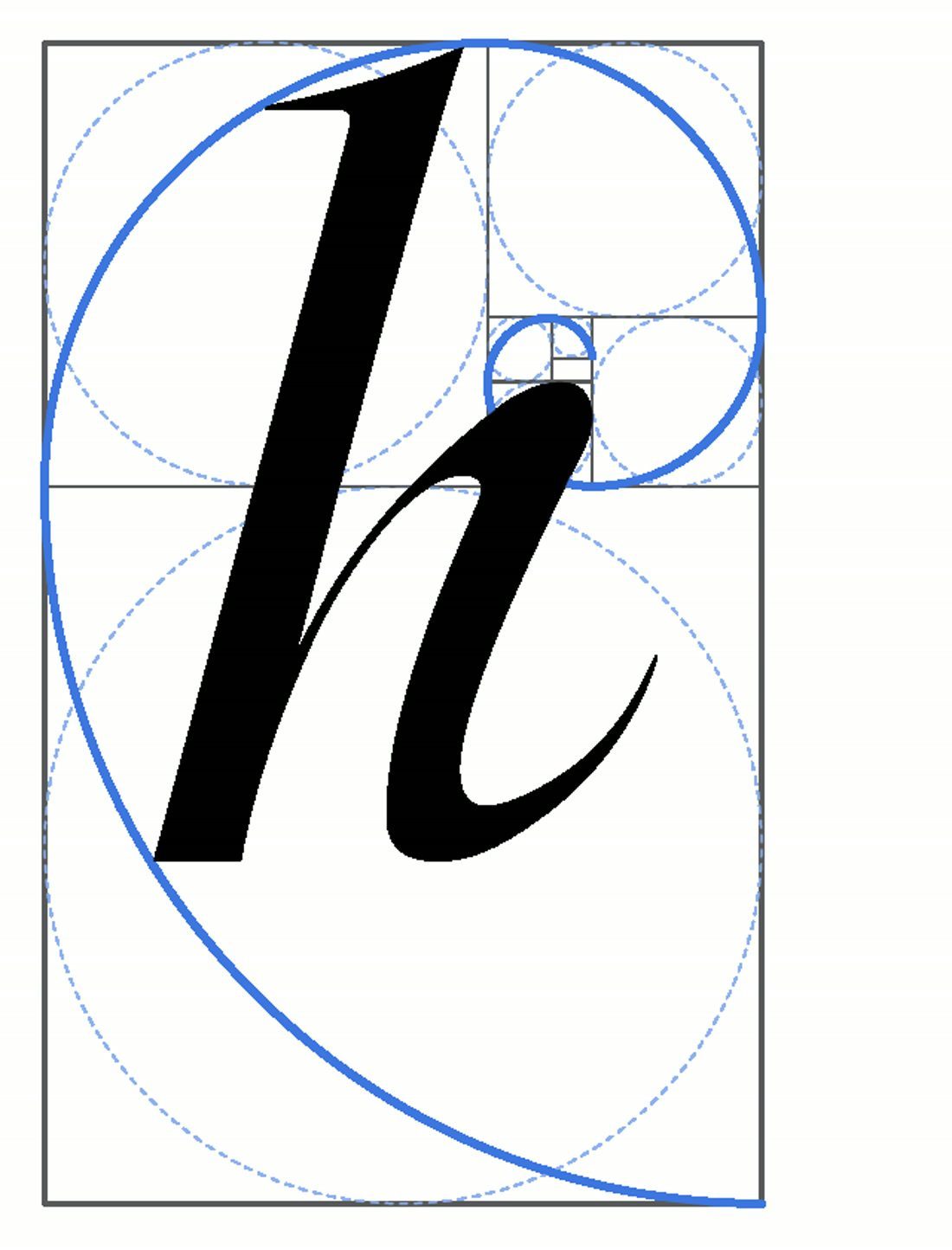
The letterform is drawn on the golden ratio, so the proportion reads as resolved before a single word is processed. Heritage and modernity meet in one balance, a serif gesture beside a modern, minimal sans.
The h, constructed on the golden ratio
The Sun initiates. The Moon perfects.
The Highlight London creative architecture
Sun and Moon, a dual creative system
Our creative direction runs on two forces, the Sun and the Moon. This polarity reflects the balance between creativity and precision that defines the studio.
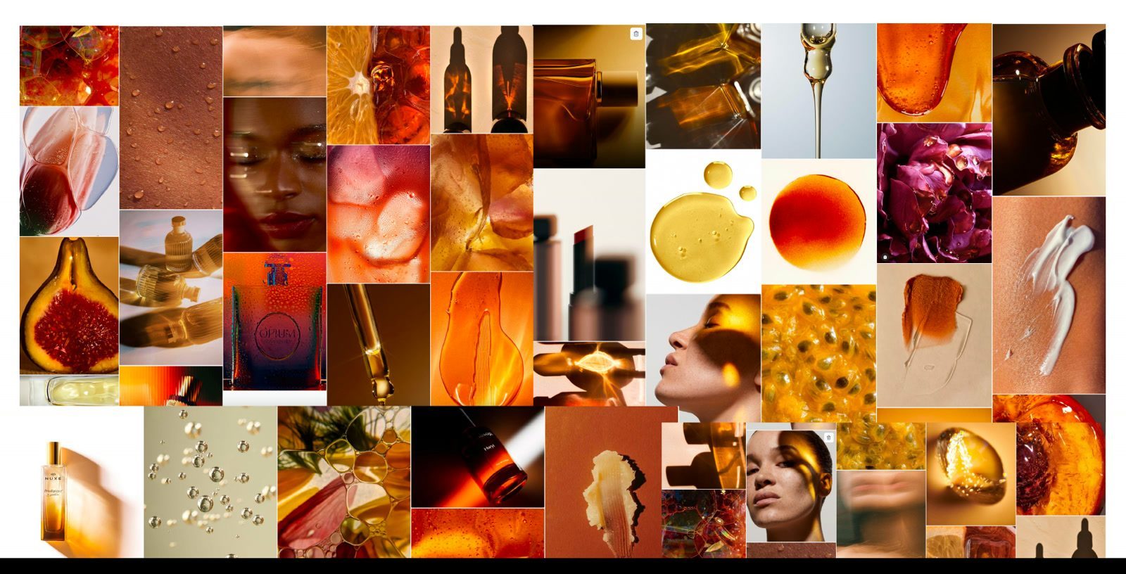
The Sun is the creative force. It is intuitive, expressive and exploratory, warm with gold, rose and amber. Its role is to generate ideas, translate emotion into form and bring light to what is not yet visible. The Sun is where imagination and experimentation lead the storytelling.
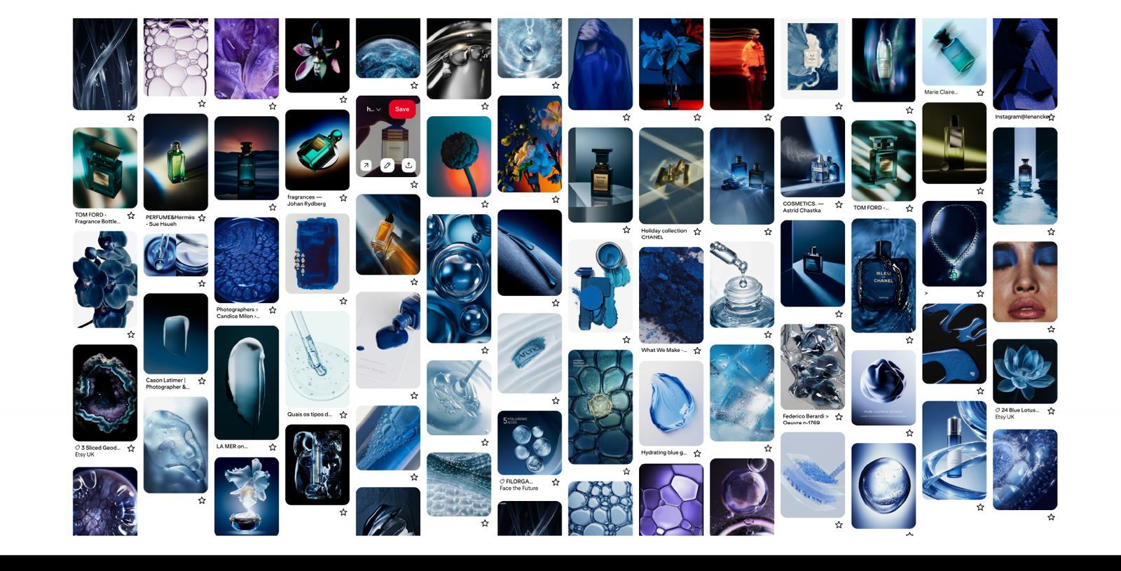
The Moon is the operational force. It is analytical, structured and reflective, cool with silver, graphite and deep blue. Its role is to refine, organise and give rhythm to the creative flow. The Moon holds precision, clarity and executional excellence across every layer of production.
Together they form the creative architecture of Highlight London. The Sun initiates and the Moon perfects, so every project pairs aesthetic sensitivity with operational intelligence, intuition translated into impact.
Moodboard · SunMoodboard · Moon
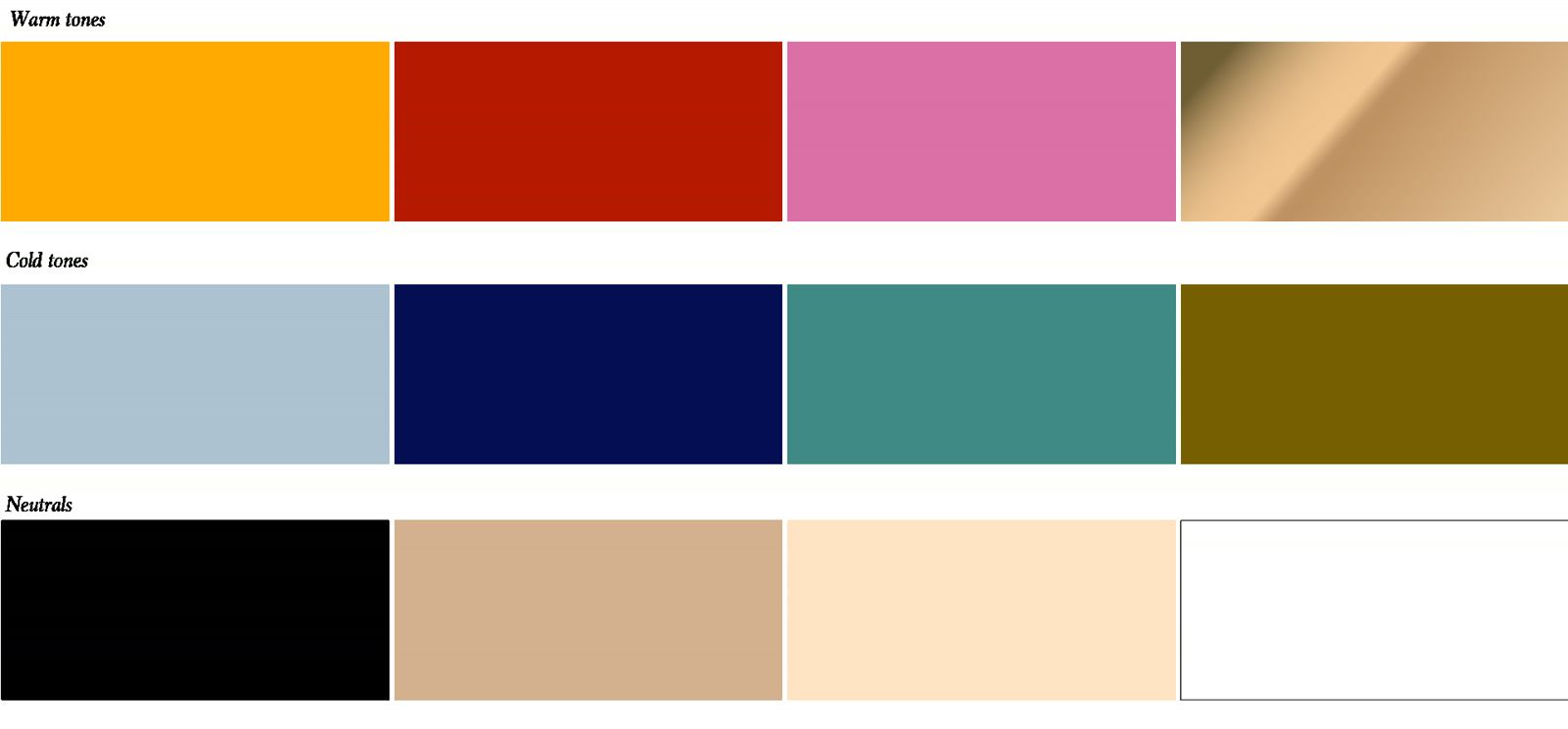
The palette
The system carries three families. Warm tones bring amber, red, rose and gold. Cold tones bring sky blue, navy, teal and olive. Neutrals hold black, camel, cream and white. Warmth leads, cool structures, neutrals let the work breathe.
Warm tones · cold tones · neutrals
Creative principles
Five lines hold the work to standard.
Every image is editorial.
Every product is sculpture.
We reveal the soul of matter.
Science meets spirit: texture, light, vibration.
Balance between Sun and Moon.
A voice of quiet intelligence
We speak with calm clarity. Every word carries light, intention and craft. Our voice is thoughtful and human, grounded and measured, sensitive to nuance. We speak from experience rather than theory.
Our language flows like thought, each sentence connected to the next with rhythm and intention. We write to make ideas clear, to bring beauty to light, and to express intelligence through simplicity. Highlight speaks with quiet intelligence. The words reveal the light inside ideas and the clarity behind emotion.
Questions about the brand system
What is the Highlight London brand system? It is our visual and verbal identity, organised around one idea, highlighting as an act of illumination. It covers the logo, the palette, the art direction, the creative principles and the tone of voice.
What does the Sun and Moon system mean? The Sun is our creative force, intuitive and warm. The Moon is our operational force, analytical and cool. The Sun initiates ideas and the Moon perfects execution, so creativity and precision stay in balance.
What is the logo built on? A calligraphic lowercase h drawn on the golden ratio, paired with HIGHLIGHT in tight upright capitals and a discreet LONDON. Gesture meets structure in a single mark.