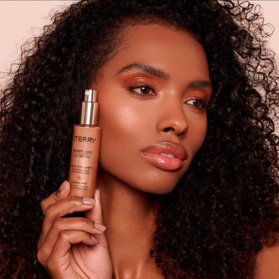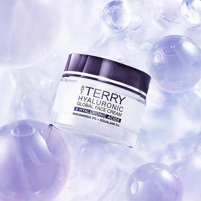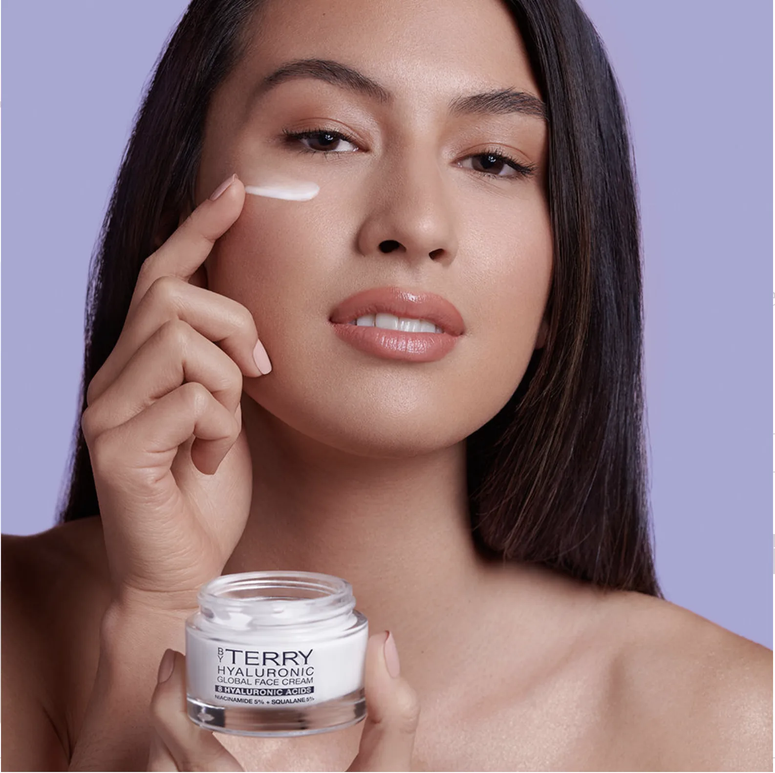
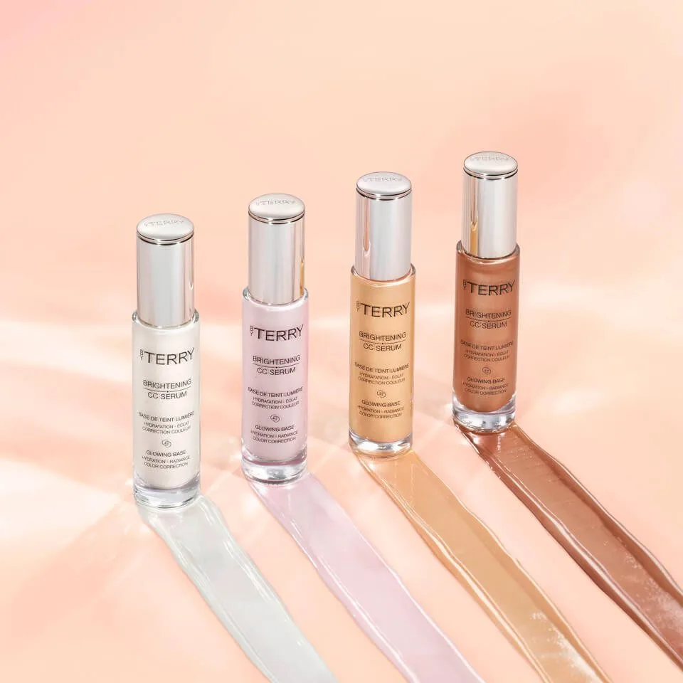
Luxury skincare packaging for the By Terry Hyaluronic franchise, where the pack has to promise radiance without borrowing the language of the pharmacy.
The brief
By Terry briefed Highlight London on packaging for the Hyaluronic Global Face Cream and the CC Serum Radiance Boosting Primer. The system had to embody the house's commitment to luxury skincare and translate two benefits, radiance and intense hydration, in a register that belongs to By Terry: Parisian, precise, sensual.
The constraint
Hyaluronic acid is the most claimed ingredient in skincare, and most brands sell it with clinical codes: white, blue, laboratory typography, molecular diagrams. By Terry sells beauty, so those codes were off the table from the first conversation. The pack had to signal efficacy through quality of finish rather than through the vocabulary of science, and it had to sit beside By Terry's colour range without looking like a different brand.
The decision
We designed a refined visual code grounded in a soft lavender palette, the colour of the formula's promise rather than of its chemistry. Crisp typography carries the product name and the benefit with the economy of a couture label, and a discreet gold accent connects the skincare range to the house's makeup heritage. The artwork leaves space so the formula breathes, and each jar is treated as a small luxury object that belongs on a dressing table rather than in a bathroom cabinet.
The result
The Hyaluronic franchise continues to anchor By Terry's skincare offer and ladders the brand into prestige skincare territory, with a code that later products in the range can inherit.
What we took from it
An ingredient story becomes a luxury story when the pack stops proving and starts promising. The lavender palette did the work that a diagram would have undone, and the project shaped how we approach every skincare brief since: find the colour of the benefit before touching the science.