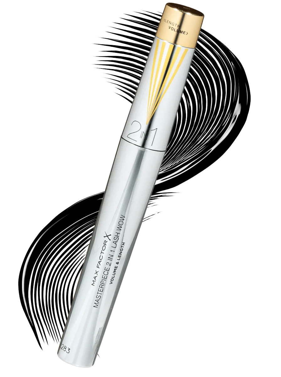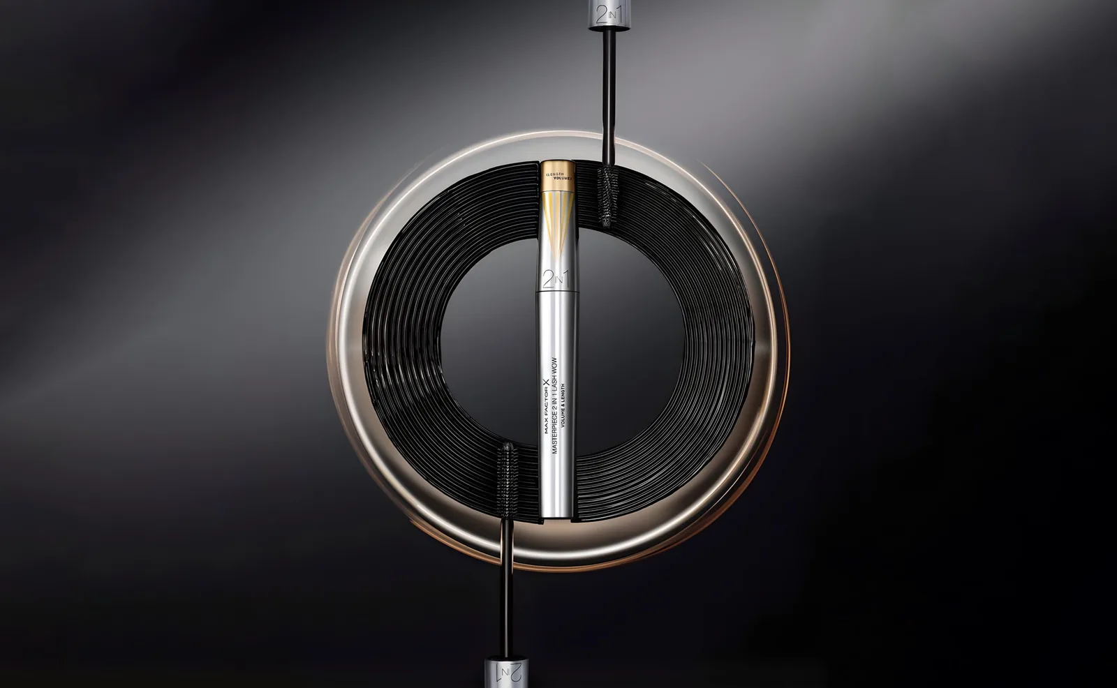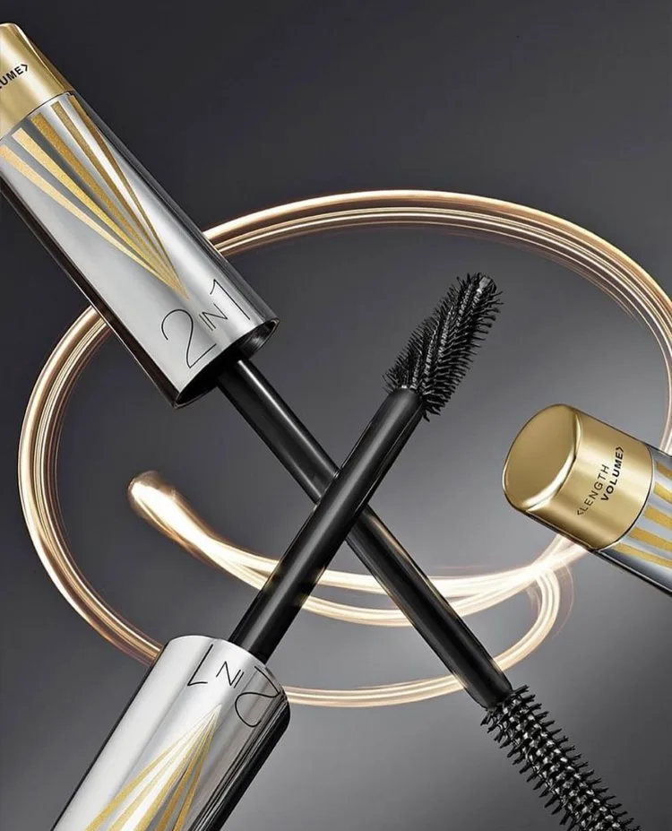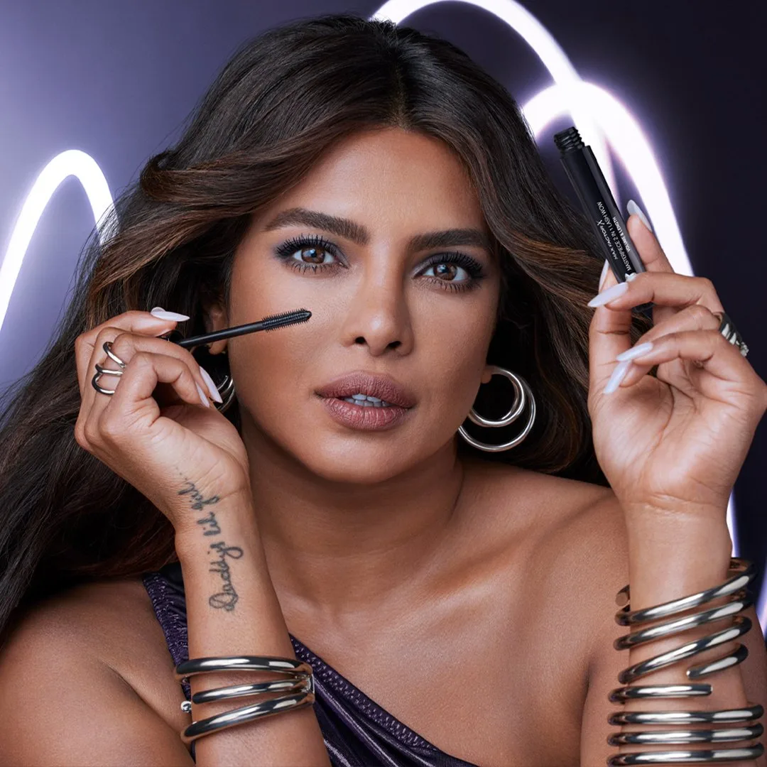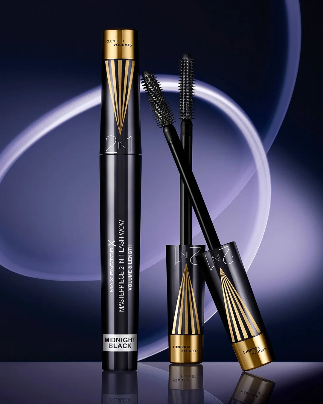
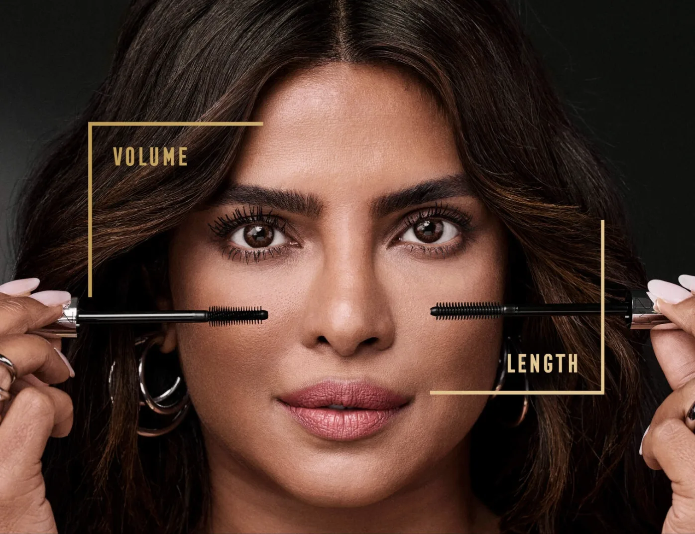
A premium mascara built around one gesture: twist the brush, choose between volume and length. The pack had to make that gesture legible from a metre away.
The brief
Max Factor briefed Highlight London on Lash Wow, a premium mascara franchise built around a modulable brush. A twist of the wand moves the fibres between a volume setting and a length setting, which gives one product the job of two. The brief asked for a pack that sells the mechanism at shelf, holds a premium position inside a mass-market aisle, and leaves room for the range to grow.
The constraint
Mascara is the most crowded fixture in colour cosmetics. Black tubes with a single accent colour fill the shelf, and a new mechanism stays invisible when the pack looks like every other one. The premium claim carried a second constraint: the finish had to read as considered rather than loud, because the Max Factor customer buys craft, and the pack had to survive the lighting, handling and pricing of European mass retail.
The decision
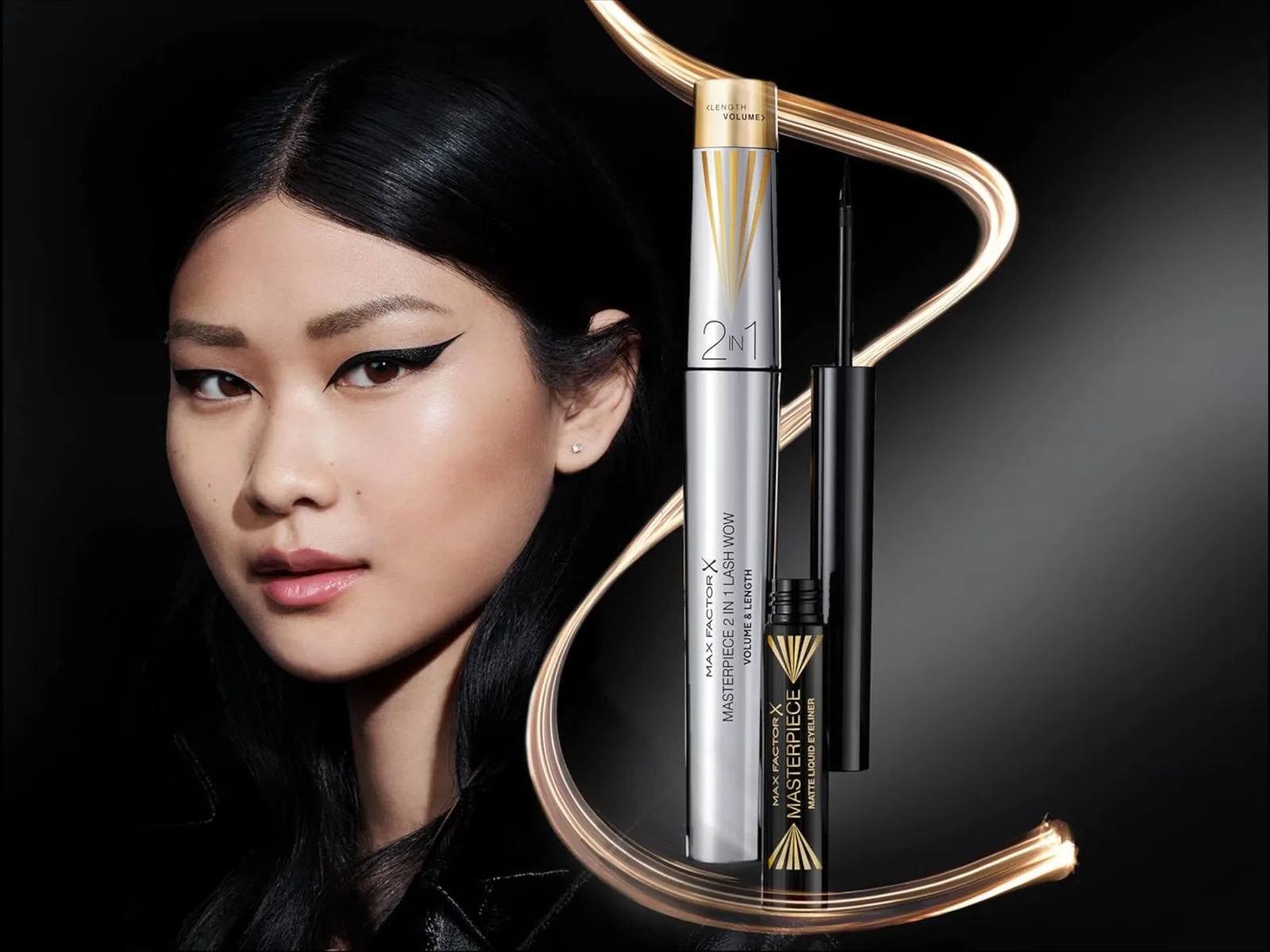
We chose a metallic pairing that the category rarely uses, gold and silver on the same object. The two metals do the explaining: two finishes, two settings, one wand. Gold carries the glamour that belongs to Max Factor, silver brings the precision of the mechanism, and the split between them draws the eye to the twist. The typography stays quiet so the metal does the work. Every decision was taken with the extension in mind, so the same logic later carried a midnight shade and a matching eyeliner without a new design language.
The result
Lash Wow now ladders into the Max Factor 2-in-1 franchise alongside Long Lash Era, and the system keeps expanding across European mass. The pack does what a mechanism pack has to do: a shopper who has never heard of the product understands the twist before reading a word. For the brand, the franchise gained a visual code that stretches across formats and shades, which is where the return on packaging design sits, launch after launch.
What we took from it
A pack that explains a mechanism earns its place before the copy is read. The metallic contrast did more for Lash Wow than any claim on the front panel, and the same principle now guides how we brief every innovation launch: find the one visual idea that tells the story of the product, then build the range around it.